My logo!
Well, I was exploring typography when I stumbled across a really interesting concept for letter forms. My love for simple yet understandable letter forms inspired me to use this as the initials for my design business logo.
When I met Toki, she was loud and clear about what she wanted. I was very mistaken when I did not take her seriously as I provided other examples of what her logo could be.
With a quick sketch on the back of a receipt, it was loud and clear what my job was. To find a way to make this memorable iconic as well as fun and enticing with loud brand colors. Lesson learned. Very proud to see this logo. Continue its life on the streets of Bardstown Road in louisville Kentucky and New Albany, Indiana.
In 2010 I began working with David Easterling as he was in the throes of reviving the local beer legend, "Falls City Beer". I provided many designs from tap handles to t-shirts and the very last thing we did was solidify the Falls City Beer logo, shown here. David sent me a skewed photo of a beer sign on a wall. My job was to use this image, square it up, to build the logo in vector format as we see it on all products and communication today.
A collaboration to say the least! I was the third designer to take on this logo for Oak & Swan Barbershop in Louisville Ky. The swan decoy was all we picked up. I added barber stripes and the look of hand tooled lettering to carve out the final product which lives now as 3d signage, business cards, website and stickers.
In 2002 Roger Baylor from New albanian brewing company asked me to design a logo for their new brew operation in New albany Indiana. I knew they wanted something that hinted "revolution" and "soviet era party graphics" as well as speaking to its strength and knowledge of beer and sense of place. The result is a timeless and memorable mark, known area wide.
Hinterhof is a craft micro roasted coffee shop in the germantown neighborhood of louisville. Hinterhof in german = "Back yard" which they do have a very nice back yard entrance and patio.
Sarah and john knew they wanted an artful latte design of a swan. We set up a photo shoot with a skillful barista and captured the photograph that was used to create the logo image. Since they are also the owners of Oak and Swan barbershop and it shares the building, we wanted to use the same letter forms to tie it in together.
In 2024, brad swope and carson torpey asked me to design a logo and t-shirt design for the newly created "kentucky bicycle hall of fame". During our first meeting, Carson, who is arguably the most knowledgeable Bicycle historian in our area, brought in his collection of historic Bicycle medallions from the golden age of cycling. This provided the inspiration needed to create the logo head badge we see today.
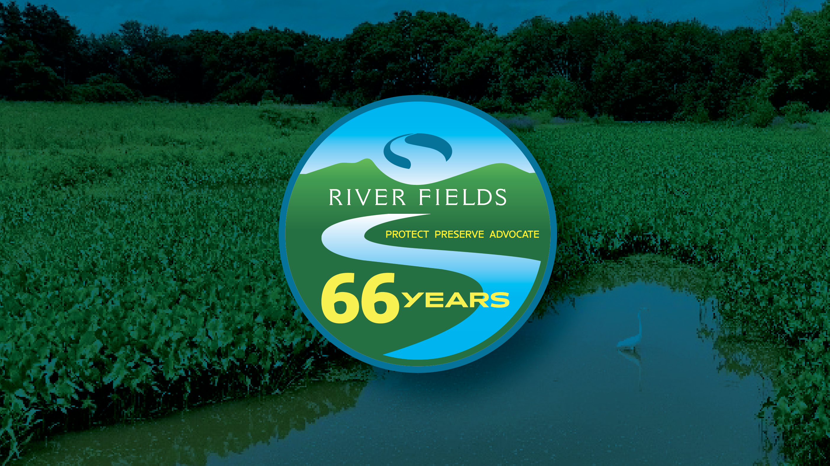
River fields, an area land conservation group asked me to design a logo for their 65 year anniversary of protecting lands on and around the ohio river in Jefferson, Oldham and Shelby counties in Kentucky. we updated it for 2025, showing 66 years.
jewel's catfish bait has been around for over 50 years. Recently acquired by hunter herring in Taylorsville, the brand needed a distinctive and memorable mark. Knowing how old the brand was, I chose to focus on classic fonts with a distressed texture to tell people how long this product has been around. Jewel's continues to be very successful as their product becomes available on a national level.
Kizito cookies began baking and offering cookies at their bardstown road, Louisville KY store in 1990. the image of Elizabeth kizito with a basket of cookies on her head is known throughout the region.
I took their existing logo elements and found letterforms and bright colors that were better suited for retail and packaging for a brand with African heritage and lineage. You will find this mark on all updated packaging available in area stores as well as that original bakery and store on bardstown road.
Crazy Ridenfaden Cyclists is a community bicycle group located in the germantown neighborhood of Louisville KY. This mark, updated for 2025, is a revival of the original 2015 logo for the clubs 10 year anniversary and will be shown on the 2025 cycling kits.
Parkway Diner in Louisville, Kentucky is another fantastic addition to the local culinary landscape.
While the location is very well known as the former cottage Inn, the owners have since, breathed new life into the space. It now operates as a diner serving breakfast and lunch every day. Louisville's beautiful eastern Parkway is the setting for this casual diner concept with elevated menu items.


